Designing for Sound-Off: What I Learned Testing Muted-Feed Ads
I design every feed ad for the muted majority first, then treat sound as a bonus layer. Here's the workflow my agency team runs before anything ships.
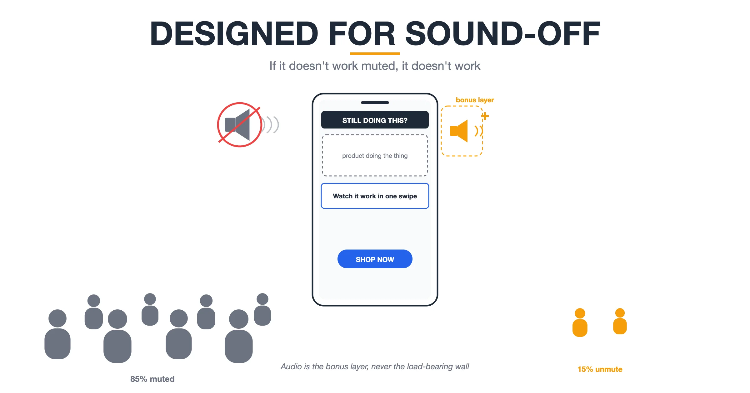
Practitioner playbook — a composite field guide written from the perspective of a Performance Agency Founder. Figures are illustrative, not verified client results.
Early in my agency career, a client asked me a question I couldn't answer: "If I watch this ad with the sound off — which is how my team watches everything on the train — does it still sell?" We had built the ad around a voiceover. The joke, the pitch, the proof — all of it lived in the audio track. Muted, the ad was a stranger's phone wallpaper: pretty, legible-ish, and completely inert.
That embarrassment turned into a method. I now design every feed ad sound-off first and treat audio as a bonus layer, never a load-bearing wall. Then we tested it: paired variants of the same concept, one built audio-first, one built mute-first, rotating across client accounts on modest test budgets. The pattern held often enough that mute-first became our shop's default, and audio-first became the exception I have to justify in writing.
What follows is what muted-feed testing taught me: how to assume silence, the on-screen text specs we hold ourselves to, the silent story beats that replace a voiceover's job, and the mute test every ad must pass before it ships. Every figure is an illustrative rule of thumb from my playbooks — ranges, not verified client results.
Start From an Assumption: Almost Nobody Hears Your Ad
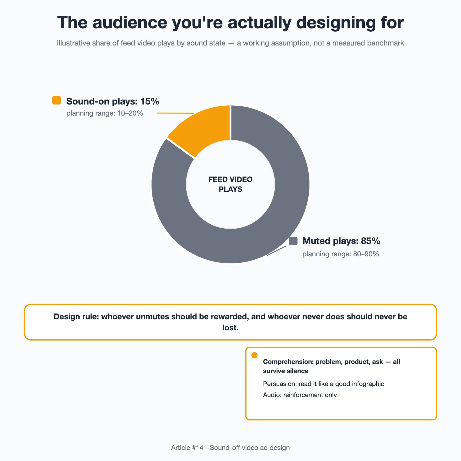
The industry has repeated a stat so long — roughly 70–90% of feed video watched muted — that it stopped being a number and became weather. I treat it like weather: I don't audit the exact percentage per placement; I plan as if most viewers are in silence, in public, or both.
So the first diagram above is the audience I actually design for: a big muted block and a smaller sound-on block. When I brief my team, the assumption gets operationalized into three planning rules:
- The comprehension bar: a viewer who never turns sound on must still understand the problem, the product, and the ask. If any of the three lives only in the audio, the ad is broken at the storyboard stage, not the editing stage.
- The persuasion bar: the mute experience can't just be understandable; it has to be compelling. Reading your ad silently should feel like scanning a very good infographic, not decrypting a caption file.
- The upside framing: sound-on viewers are not a separate audience to ignore — they're a bonus channel. When they unmute, everything audio can add (tone, demonstration sounds, a voiced proof line) should land as reinforcement, never as information they were required to have.
The design consequence is simple: whoever unmutes should be rewarded, and whoever never does should never be lost.
On-Screen Text Is the Voiceover Now — Give It Real Specs
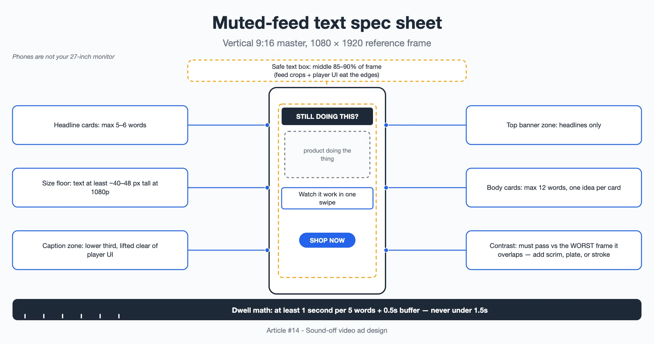
The moment text becomes the primary carrier of meaning, it deserves the rigor we used to give voiceover scripts. The diagram shows the spec sheet we pin above every edit bay: safe zones, size floor, contrast requirement, and reading-time math. The reasoning behind each line:
- Caption zone: lower third, but lifted clear of the platform UI — we keep all text inside a safe box roughly 85–90% of the frame, because feed crops and player controls eat edges.
- Headline cards: maximum five to six words. If a headline needs a comma splice to fit, it needs a rewrite, not a smaller font.
- Body lines: maximum twelve words per card, one idea per card. The eye reads silently slower than the ear hears aloud.
- Size floor: on a 1080p vertical master, we aim for text that renders at least around 40–48 pixels tall, because phones are not your 27-inch monitor.
- Contrast: text must pass against the worst frame it overlaps, not the average one — which means backing plates, scrims, or strokes, chosen per scene.
- Dwell time: every text card must stay up long enough to be read at a commuter's pace. Our napkin math: at least one second per five words plus a half-second buffer, and never less than 1.5 seconds.
One more habit: we screenshot every text frame and open them as a strip. Anything that can't be read as a still image gets rewritten. Motion is not a reading aid.
Build Silent Story Beats, Not Voiceover With Subtitles Bolted On
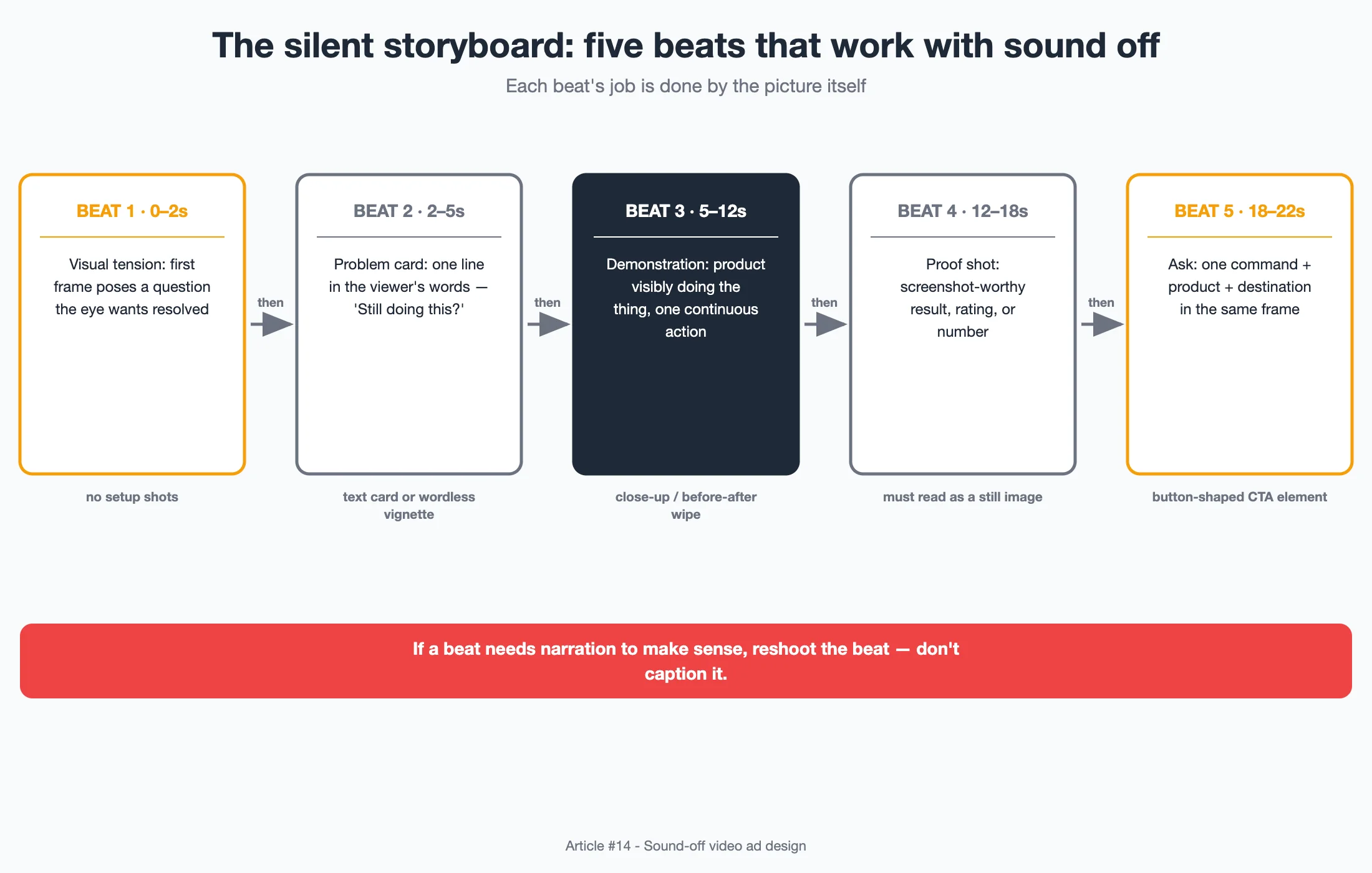
The biggest failure mode I see in "mute-optimized" ads is translation: taking an audio script and adding captions. The structure is still audio-shaped — a slow setup that only makes sense because a voice is carrying it. What works instead is composing the ad as silent beats, where each beat's job is done by the picture itself.
The flowchart above is the beat structure we storyboard with. In prose:
- Visual tension (0–2s): the first frame contains a question the eye wants resolved — something visibly wrong, surprising, or mid-transformation. No setup shots. Setup is what muted viewers scroll past.
- Problem card (2–5s): one short text card or one wordless vignette that makes the tension personal. "Still doing this?" can do the work of a twenty-word voiceover.
- Demonstration (5–12s): the product must be seen doing the thing, legible without commentary. Close-ups, before-and-after wipes, one continuous action. If a viewer needs narration to know what the demo proves, reshoot the demo.
- Proof shot (12–18s): a still-frame moment that could be screenshotted and believed — the result, the rating, the texture, the number.
- Ask (18–22s): a single command with a visible destination. Text, product, and button-like CTA shape in the same frame.
Notice what's absent: nothing here depends on timing dialogue or syncing to a music hit. The beats are load-bearing because they are seen, not heard.
Then — and Only Then — Decide What Audio Is For
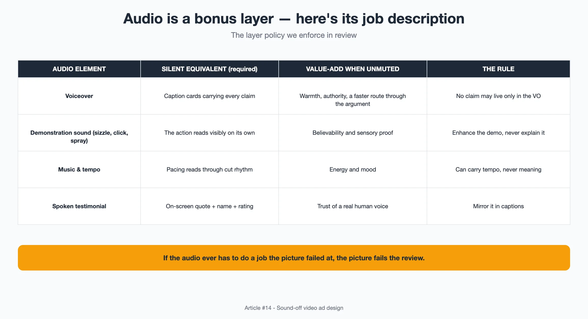
Designing sound-off first is not designing sound-bad on purpose. Once the silent cut works, audio becomes a deliberate enhancement layer, and the table in the diagram is how we decide what each layer is allowed to do. The short version of our policy:
- Voiceover may add warmth, authority, or a faster route through the argument — but every line must be optional. If the VO contains a claim the captions don't carry, it's a required layer wearing a bonus costume.
- Demonstration sound — the sizzle, the click, the spray — is underrated. Muted-first thinking doesn't mean muted-only thinking; sensory audio makes the demo believable to the minority who unmute, at almost no comprehension cost to the rest.
- Music and tempo carry mood and pacing. They can raise energy, but they can't carry meaning, so we never let a beat drop stand in for a story beat.
- Spoken proof (a customer testimonial's actual voice) is a trust layer for the sound-on slice, mirrored by the on-screen quote for everyone else.
The discipline is one sentence, and we say it out loud (ironically) in every review: if the audio ever has to do a job the picture failed at, the picture fails the review.
The Mute Test: Nothing Ships Until It Passes Without Sound
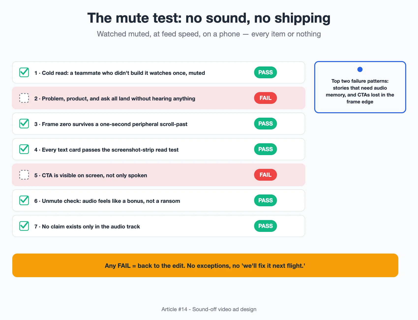
Our pre-launch gate is embarrassingly simple and fanatically enforced: we watch the cut muted, at feed speed, on a phone, and it must pass every item on the checklist in the diagram. The items that fail most often are the second and the fifth — stories that require audio memory of an earlier line, and CTAs that vanish into the frame's edge.
How we run it:
- The cold read. One team member who didn't build the ad watches once, muted, then states out loud: the problem, the product, the ask. Three for three, or back it goes.
- The scroll-past. We drop the ad into a real feed environment on a phone at arm's length and check whether it survives being seen peripherally for one second. Frame zero gets rewritten until it does.
- The screenshot strip. Every text and proof frame exported as a still, reviewed as a sequence of images. The ad must read as a coherent mini-deck.
- The unmute surprise. Then we watch it with sound and ask: does the audio feel like a bonus or a ransom? If comprehension jumps too much, the silent version is underbuilt. If the audio adds nothing at all, we're wasting a layer that could earn the sound-on slice.
Shipping the mute test means the sound-on audience gets a better ad too, because reinforcement requires a base to reinforce.
What the Paired Variants Actually Taught Me
Our audio-first versus mute-first tests ran across accounts and categories on small, capped test budgets — so what follows is a pattern I trust, not a result I'd publish as a benchmark. Consistently:
- Mute-first cuts held viewers longer in the first six seconds — no caption card at second two demanding a sound the viewer didn't have.
- The gap was largest on demonstration-heavy products — anything you watch working — and narrowest on founder-story-style ads where a warm voice is half the appeal even at low volume.
- Sound-on completion behavior barely changed between the two builds. The unmuted minority are generous viewers; they'll tolerate a talky ad. Mute-first designs earned the indifferent majority, which is most of an auction.
- The quietest lesson: mute-first ads were cheaper to localize and repurpose. Text cards get translated; voiceovers get re-recorded.
I still green-light an audio-led concept occasionally — a song, a creator's voice, an ASMR demo — but now I require the silent skeleton to pass the mute test first, with the audio as dress rehearsal, not scaffolding.
The Real Question: Would This Ad Work as a Poster?
Strip away the motion, the mix, the licensed track — can a single frame of your ad, pinned to a wall with a caption beneath it, make a stranger want the thing? That's the question muted-feed testing drilled into me. Most ads that fail it aren't failing because they lack sound. They're failing because there was never a picture strong enough to carry the idea, and the audio was hired to hide that. Sound-off design is just the honest version of asking, out loud, in silence: is the thing itself interesting?
Sources:
- Meta Ads Manager delivery and placement documentation – how feed placements crop video and surface captions by default.
- TikTok Ads creative best-practices resources – on-screen text safe zones and sound-off viewing guidance for feed placements.
- YouTube/Google Ads player behavior documentation – default mute states and caption rendering across embedded and feed placements.
- W3C Web Content Accessibility Guidelines (captioning guidance) – principles for accurate, synchronized, and readable on-screen text that informed our caption specs.
Disclosure: This piece is written from a practitioner's perspective to share a working method. It is not a customer testimonial, and any numbers are illustrative examples, not guaranteed outcomes.