The Product-Demo Script I Reuse: Problem, Demo, Proof, Offer
The repeatable 4-beat script skeleton I reuse for product-demo video ads - problem, demo, proof, offer - with beat-by-beat timing for a 20-second cutdown.
Practitioner playbook — a composite field guide written from the perspective of a UGC Creator & Scriptwriter. Figures are illustrative, not verified client results.
Most people think a product-demo ad lives or dies on the hook, and sure, the first three seconds decide whether anyone stays. But once the thumb stops, a different question takes over: is there actually a script here, or am I just watching someone hold a product and talk? I have written enough demo ads to know the second one is far more common, and it is why so many ads get watched for six seconds and then abandoned. The opening earned attention; nothing after it knew what to do with it.
So I stopped writing demo ads from scratch. I now reuse one skeleton — four beats, in a fixed order — and I only change the content inside each beat. It is boring on purpose. Boring structure is what lets the product be the interesting part. What follows is the four-beat skeleton, how I time it for a 20-second cutdown, why the first frame is the whole ad in miniature, the proof ladder I climb instead of making claims, and the five ways a demo ad quietly breaks.
The Four Beats: Problem, Demo, Proof, Offer
Every product-demo ad I brief has exactly four beats, and they always come in this order. Not because the order is sacred, but because each beat answers the question the viewer is asking at that moment, and the questions come in a sequence.
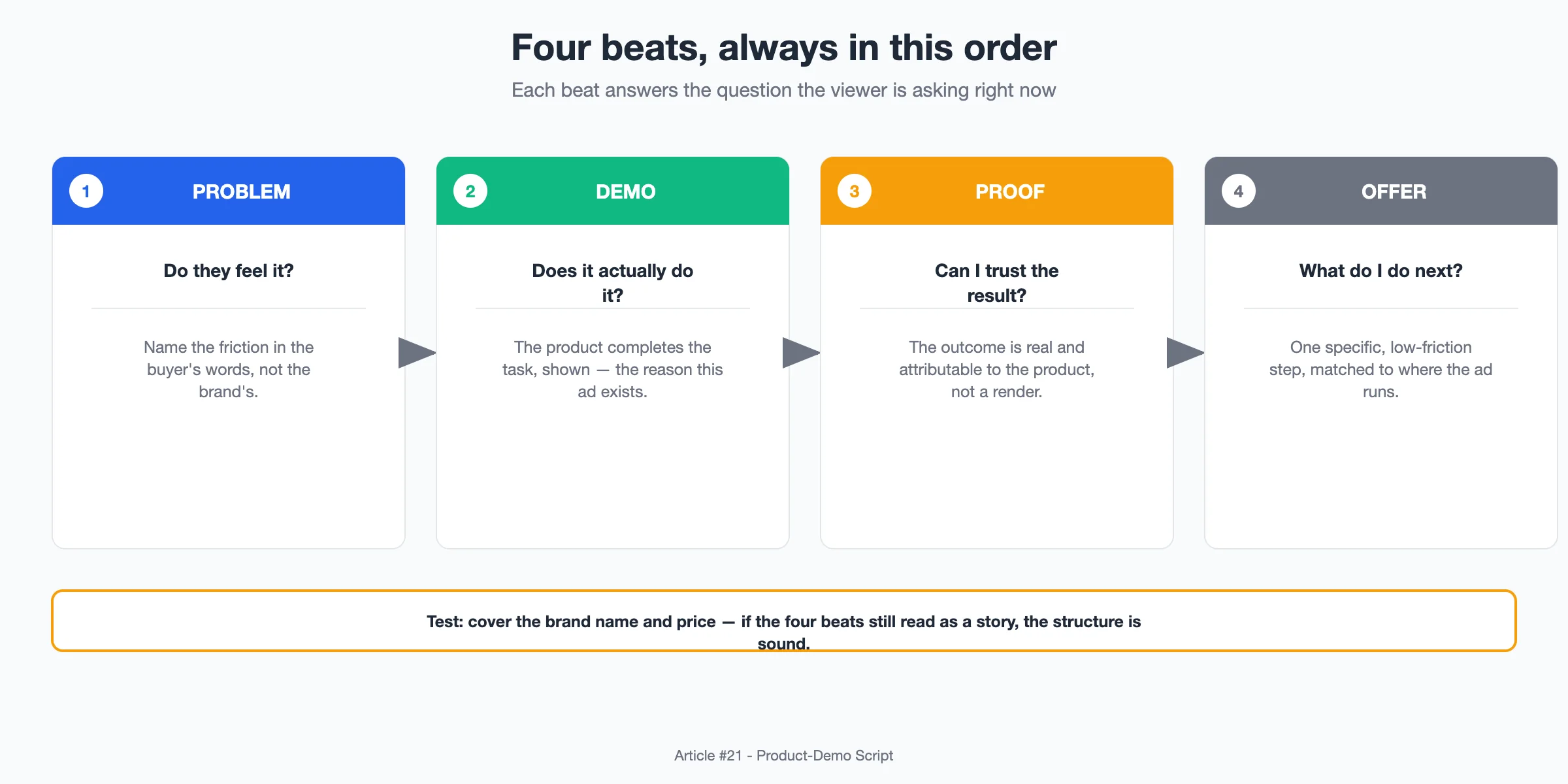
- Problem: name the friction the viewer already feels, in their words, not the brand's. If they do not nod here, the rest is a pitch they did not ask for.
- Demo: the product does the thing. This is the middle of the ad and the reason a demo ad exists at all — the mechanism, shown, not described.
- Proof: the result is real and attributable to the product, not just a nice render. This is where most demo ads cheat, and where I will spend the most care.
- Offer: one specific next step, matched to where the ad runs. Not "learn more" — a single low-friction action.
The test I run on any draft: cover up the product name and the price. If the four beats still make sense as a story, the structure is sound. If removing the brand turns it into a generic "wow look at this" montage, I never had a script, just footage.
Timing It: My 20-Second Cutdown
The skeleton is the same whether the ad is 15 seconds or 45, but the timing is where a lot of scripts quietly fail. The problem beat and the offer beat are short; the demo and proof beats are where the seconds actually buy you something. Here is how I split a 20-second cutdown, which is the length I brief most often because it fits almost every placement.
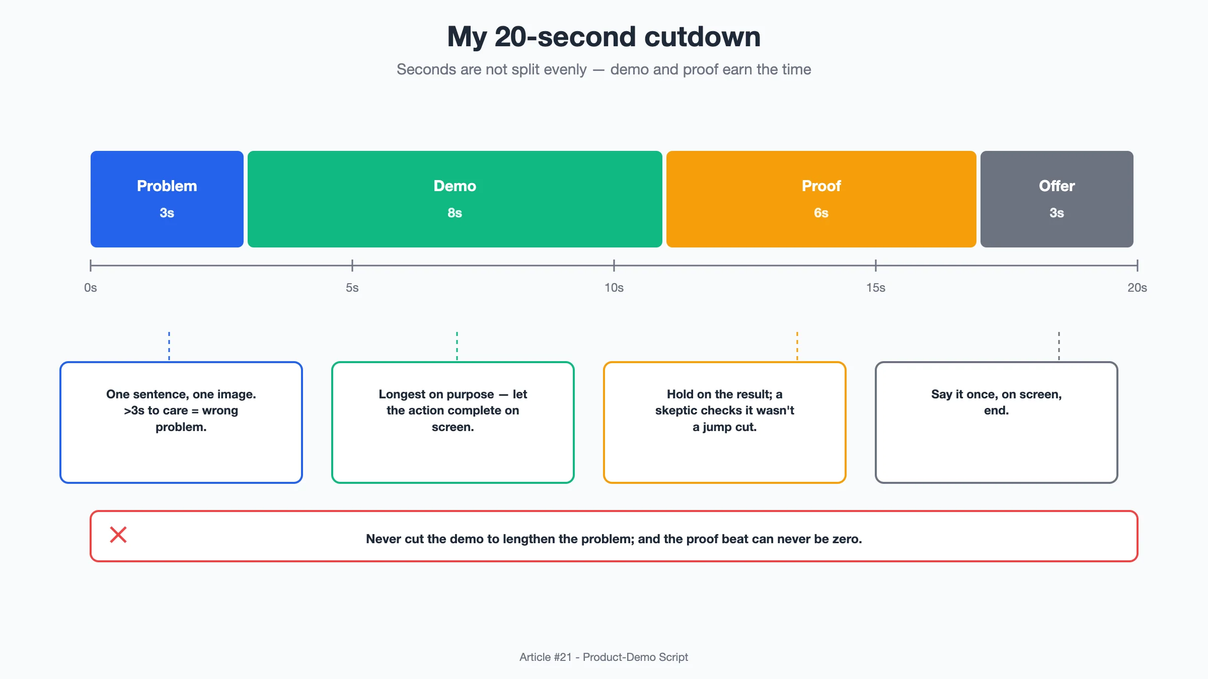
Roughly, my default allocation:
- Problem — about 3 seconds. One sentence, one image. If I need more than three seconds to make someone care, the product is not the problem they have.
- Demo — about 8 seconds. This is the longest beat on purpose. The mechanism has to be legible, so I give the action room to complete on screen rather than cutting away mid-motion.
- Proof — about 6 seconds. Show the result land, hold on it, let a skeptic see it was not a jump cut.
- Offer — about 3 seconds. Say it once, put it on screen, end.
Two things I watch in the timing. First, the demo beat never gets cut to make room for more problem — new clients always want a longer setup, and it is the least valuable real estate in the ad. Second, the proof beat cannot be zero. An ad that demos and then jumps straight to the offer is asking for trust it never earned.
The First Frame Is the Whole Ad in Miniature
Before the beats run, one frame carries the entire promise: the thumbnail, the literal first frame. For a demo ad this is not a branding decision, it is a compression test. If the product and its benefit cannot be read in a still, they are not clear enough to be the ad's subject.
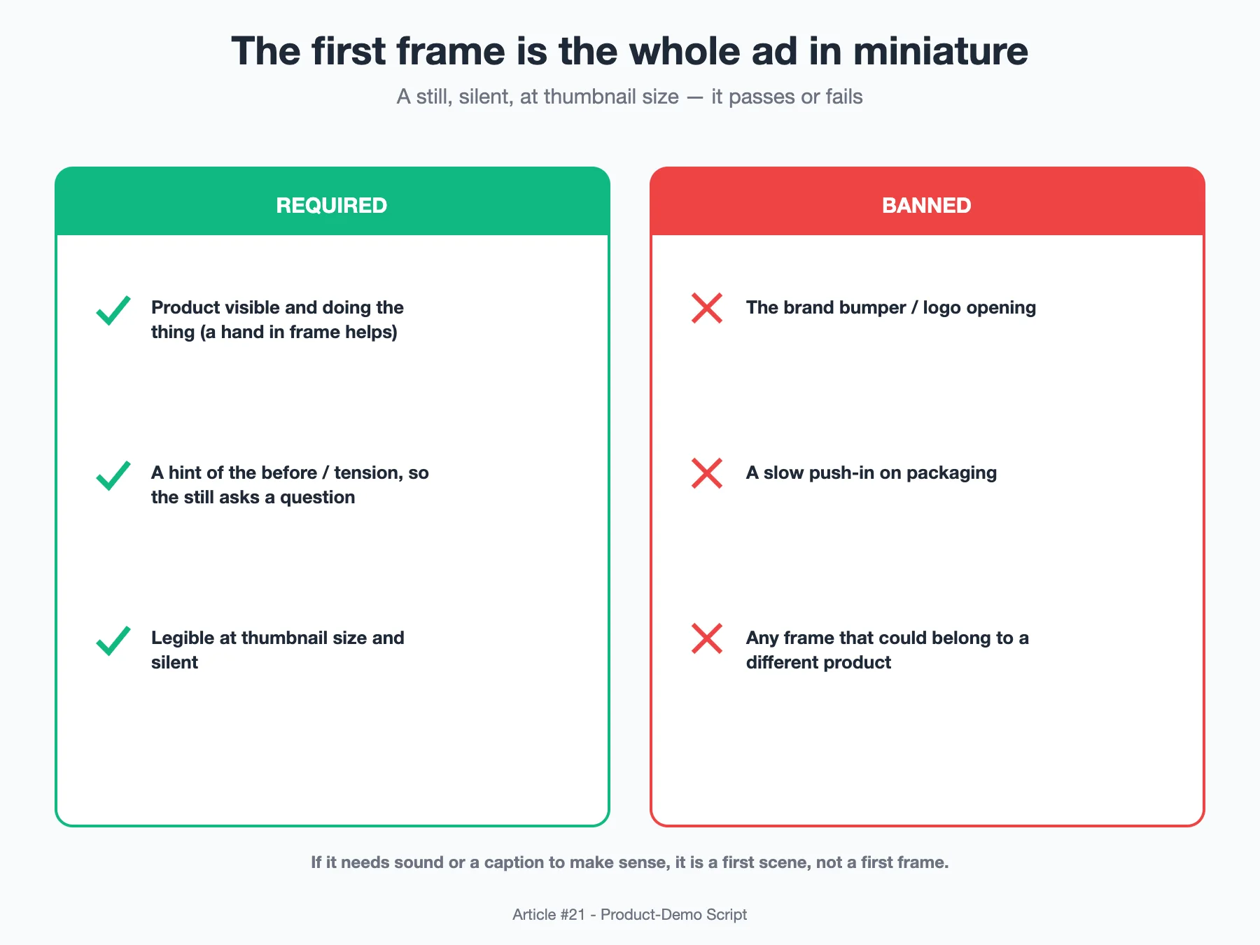
What I require in the first frame:
- The product is visible and doing, or about to do, the thing. A hand in frame helps; it signals a human is testing this, not a studio rendering it.
- A hint of the before-state or the tension, so the still asks a question. A clean product on a white background answers nothing.
- Legible at thumbnail size and silent. No logo-first, no sentence of text, no establishing shot. If it needs sound or a caption to make sense, it is not a first frame, it is a first scene.
What I ban: the brand bumper opening, a slow push-in on packaging, and any frame that could belong to a different product. Those all spend the one frame you do not get back.
The Proof Ladder: Show, Do Not Claim
"Proof" is the beat people fill with adjectives, and adjectives are not proof. I think about evidence as a ladder with rungs of decreasing credibility, and I always try to film the highest rung the product can honestly reach. The higher the rung, the fewer claims I have to make out loud, because the viewer watched it happen.
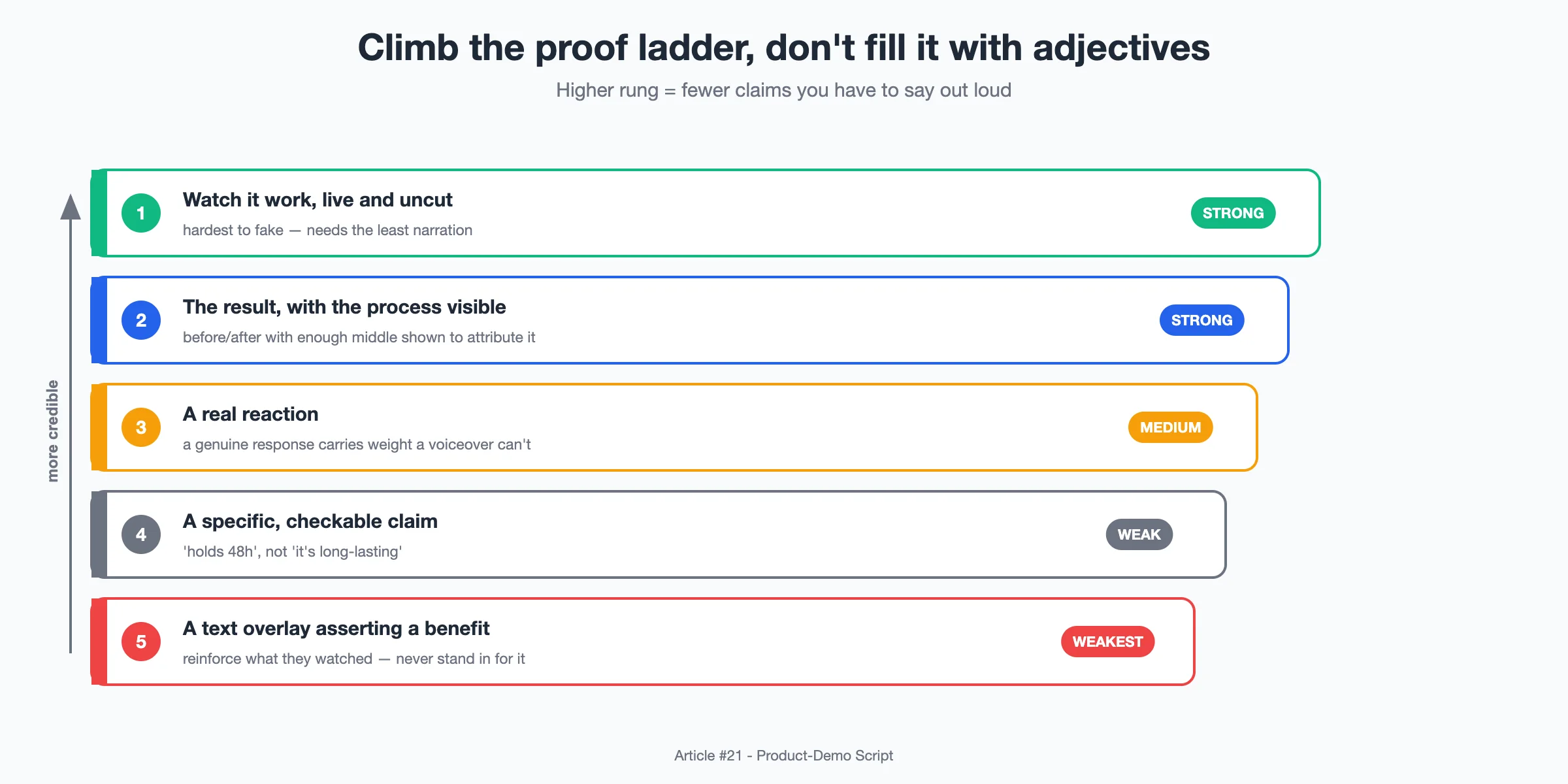
From strongest to weakest:
- Watch it work, live and uncut. The product completes the task on camera in one take. Hardest to fake, so it needs the least narration.
- The result, with the process visible. Before-and-after, but you can see enough of the middle that the after is attributable to the product, not to a cut.
- A real reaction. A person's genuine response to the outcome carries weight a voiceover cannot.
- A specific, checkable claim. "Holds 48 hours" is a claim; "it is long-lasting" is filler. Only claims a skeptic could test belong here.
- A text overlay asserting a benefit. The bottom rung. Use it to reinforce what they already watched, never to stand in for it.
My rule: if the proof beat rests on the bottom two rungs, the ad is a claim with B-roll, and I go back and film a higher rung. This is also where compliance quietly lives — the higher rungs are honest by construction, because the viewer saw the thing happen.
The Five Ways a Demo Ad Quietly Breaks
When a demo ad underperforms, it is almost never the hook. It is one of five structural failures, and each has a specific fix. I run every draft against this list before I call it done.
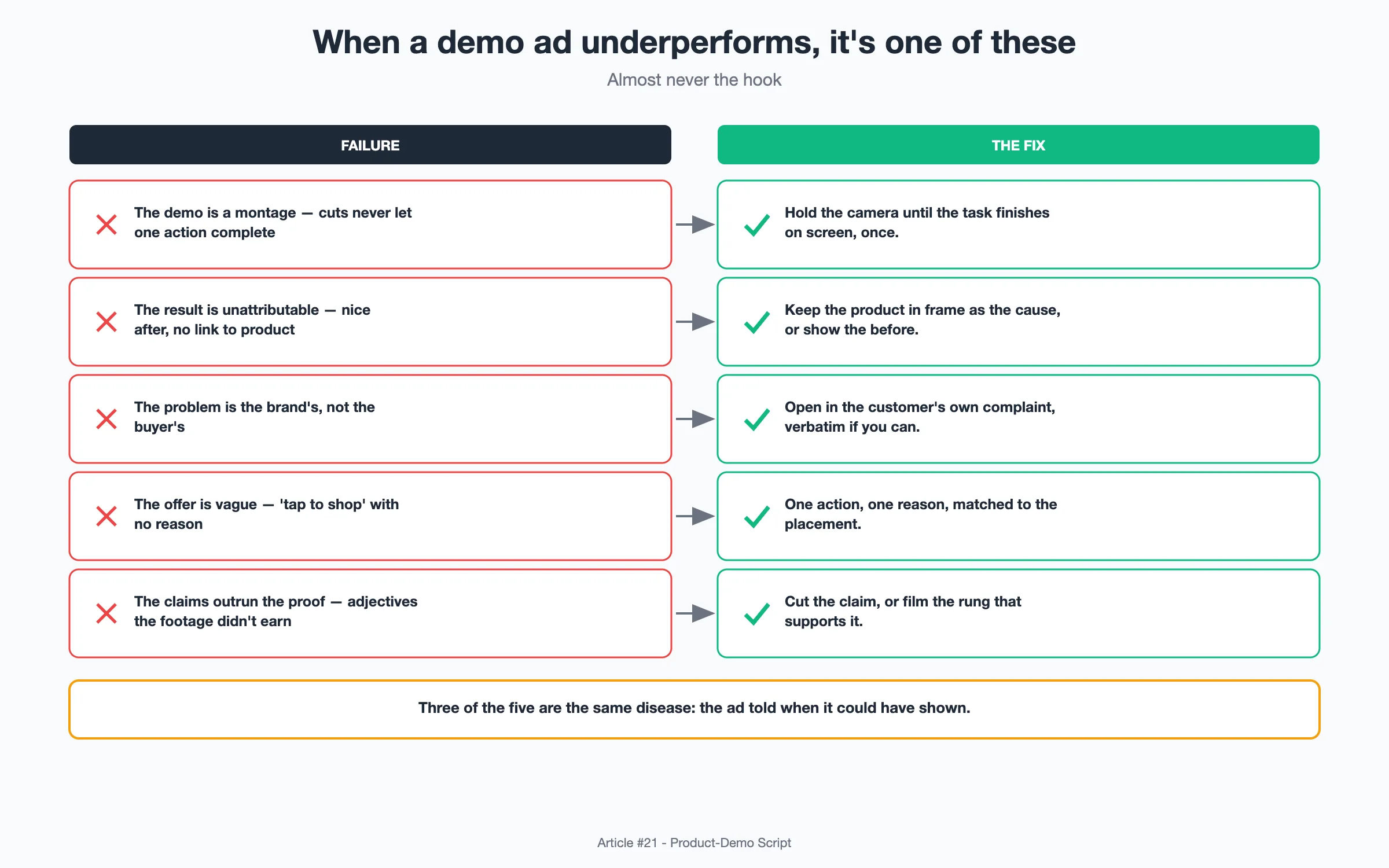
- The demo is a montage. Fast cuts that never let one action complete, so nothing is actually shown. Fix: hold the camera until the task finishes on screen, once.
- The result is unattributable. A beautiful after with no visible link to the product. Fix: keep the product in frame as the cause, or show the before.
- The problem is the brand's, not the buyer's. Written in marketing language. Fix: open in the customer's own complaint, verbatim if I can get it.
- The offer is vague. "Tap to shop" with no reason or urgency. Fix: one action, one reason, matched to the placement.
- The claims outrun the proof. Adjectives the footage never earned. Fix: cut the claim or film the rung that supports it.
Three of the five are the same disease wearing different clothes: the ad told when it could have shown. That is the whole discipline of a demo ad, and it is why I keep the skeleton rigid — the structure is what forces me to actually show the thing.
The Real Question: Is It a Demo, or Just an Ad About a Demo?
Here is the reframe I give any client who wants "more energy" in the edit. A product-demo ad earns trust by completing one visible action the viewer could not be sure the product would do. Everything else — the hook, the pacing, the music — is there to get them to watch that action and believe it. If I speed through the demo to add energy, I have made an ad about a demo, not a demo. The boring, held, uncut moment where the product simply works is the asset. Protect it in the timeline, protect it in the first frame, and let the four beats carry it to a single clear offer.
Structure is not the creative part. That is the point. A reusable skeleton is what lets the product, honestly shown, be the only thing the viewer has to think about.
Sources:
- TikTok for Business and Meta creative best-practice guidance on short-form video structure and early-completion signals, which I cross-check my beat timing against.
- Public video-engagement and drop-off reports from tools like Wistia and Vidyard, where I sanity-check where mid-roll abandonment typically spikes.
- Platform definitions of hook, hold, and thumb-stop metrics from Meta and TikTok ad docs, used here only to name the signals, not to cite specific results.
- General direct-response video structure (problem-solution-proof-offer) as it appears across mainstream performance-marketing playbooks; the timing splits above are my own illustrative defaults.
Disclosure: This piece is written from a practitioner's perspective to share a working method. It is not a customer testimonial, and any numbers are illustrative examples, not guaranteed outcomes.